
Paint and trend forecasting companies are steadily rolling out their 2027 Colors of the Year. I’ve taken a look at every Color of the Year that’s been announced (so far) and divined what it means for bedding’s near future.
This year’s picks all point to a particularly interesting shift: Consumers’ definition of a neutral is broadening. That’s especially relevant to a bedding industry long dominated by white.
There are already signs that consumers are becoming more adventurous with color in the bedroom. In August, The Wall Street Journal ran a story, “Americans are Breaking Up With White Bed Sheets.” It said consumers are buying more patterned sheets, retailers are expanding colors and printed assortments, and designers are building multicolor beds.
Domino’s 2026 Bed & Bath Trend Watch identified three-color blocking as an emerging bedding look: one color for the headboard, another for sheets and another for the duvet, quilt or pillows. Homes & Gardens also reported this year that designers are seeing color move all the way down to the fitted sheet.
So, does that mean a Color of the Year has to become a sheet color to matter to bedding manufacturers? Not necessarily. Color trends can influence everything from photography and showroom design to accessories, ticking, piping and packaging. But bedding also gives consumers a low-commitment way to participate in a color trend. Painting your bedroom is a project; buying a new duvet or swapping out pillowcases is easier.
If white bedding is losing its grip, the 2027 Colors of the Year suggest what could take some of its place. The picks fall into three camps: blues positioned as neutrals, fresh greens and warm earth tones.
Glidden’s pick, Artifact, is described on the company’s website as “… a calm, smoky blue that feels like a reset for your whole space — no renovation chaos needed.”
The description touches on the recent trend of consumers taking on smaller home projects rather than large-scale ones. Second-quarter financial results from Home Depot and Arhaus noted a current consumer preference for light refreshes.
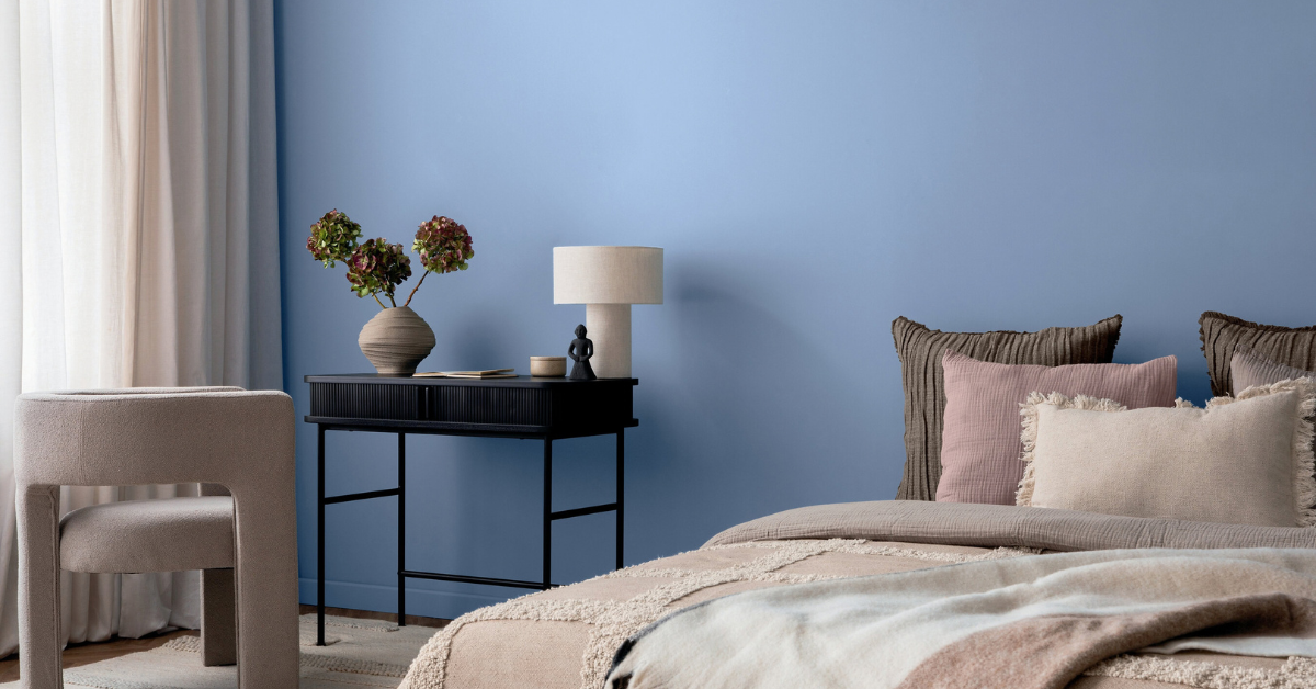
Valspar opted for a modern neutral with Cottage Door, a muted, grayed-blue with warm undertones.
“Cottage Door captures blue’s natural sense of security and trust while serving as a colorful new neutral that layers effortlessly into the home,” Valspar’s director of color marketing, Sue Kim, said.
Ace Hardware worked with trend-forecasting firm Colour Hive to develop its 2027 Color of the Year for its exclusive brand Clark+Kensington, its private-label paint partnership with Benjamin Moore. The result is Vantage Point, a rich midtown blue with subtle violet undertones.
“Homeowners are looking for more moments of connection at home, and color can have a powerful impact on how a space makes us feel,” Kim Kefko, Ace Hardware’s chief marketing officer, said in a statement. “Vantage Point brings a sense of warmth and character to interiors, offering a versatile blue that feels fresh for 2027 yet timeless enough to live with for years to come.”
Blue isn’t the only traditional color being recast as an easy-to-live-with neutral. The 2027 greens offer another fresh take on the nature-inspired color.
For Sherwin-Williams’ Lowe’s-exclusive line, HGTV Home by Sherwin-Williams, the company announced Celery, a soft, pale yellow-green, as its 2027 color of the year.
“Celery was chosen as the 2027 Color of the Year because it reflects today’s priorities: wellness, balance and connection,” said Ashley Banbury, Sherwin-Williams’ color marketing manager.
Behr developed a brand-new color, Grounded, a deep olive green with brown undertones. According to Behr’s website, the company selected it as their 2027 Color of the Year because “it reflects a shift in how people want their homes to feel — rooted, lived-in and real. It transcends aesthetics, creating spaces that invite a true sense of ease and retreat.”
If blues and greens are stretching the definition of a neutral, the year’s earth tones are warming it up. Paint company Little Greene named Marle, a midtown ochre-brown, as its color of the year.
“The choice comes as brown makes a real comeback in both fashion and interiors,” the company stated in a press release. “As our understanding of neutrals has evolved, people have been drawn to brown’s comforting appeal. They’re also looking for complex, balanced shades that bring color and personality but stay neutral and easy to scheme.”
Dutch Boy Paints and Graham & Brown both opted for dusty terra-cotta colors with their picks, Deep Rooted and Rose Earth, respectively. According to the companies, both nod to the Earth and pair well with other neutrals.
Taken together, this year’s Colors of the Year aren’t calling for neon sheets, but they do suggest the consumer definition of neutral is broadening beyond beige, white and cream. Muted blue, mossy green and dusty rose can provide the versatility consumers once looked for exclusively in white, gray and beige.