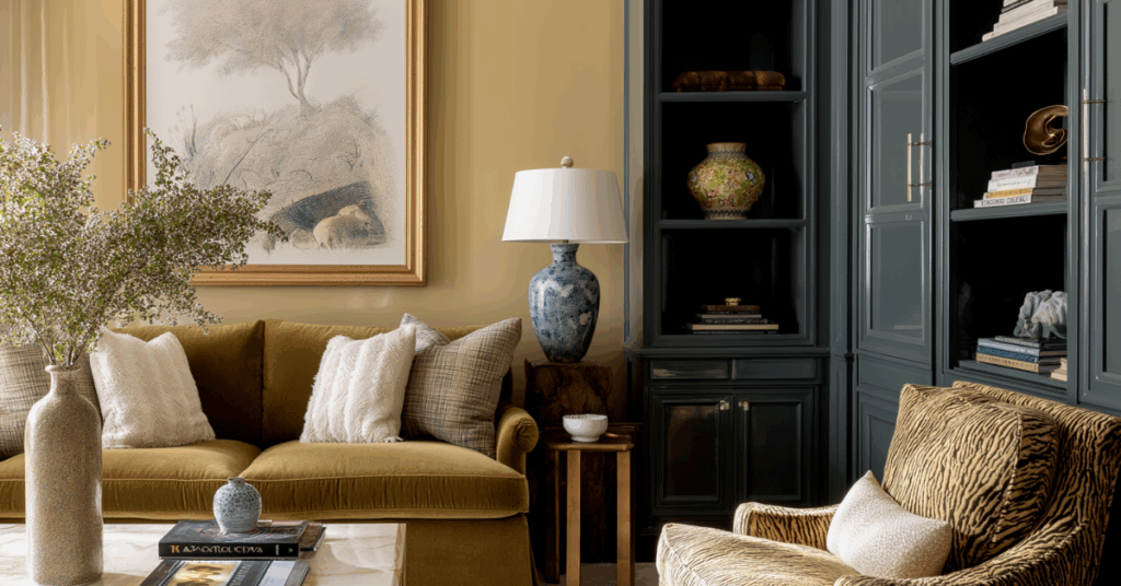
Every year, the top paint and trend forecasting companies announce their picks for color of the year. On the surface, the selections may seem random, but each one takes into account current consumer preferences, trends and the culture at large.
In 2025, an array of subdued color choices reflected a desire for comfort. For 2026, consumers are seeking connection through nature-inspired hues and looking to challenge convention, signaled by bold color choices.
“Color has long been absent from most American homes, usually out of a perception of cleanliness and convenience,” wrote Misty Sidell in an October article for the New York Times titled “Goodbye Gray Walls. Hello, Dusty Rose.” “This school of thought has heralded a proliferation of gray laminate floors, blindingly white walls and gravel-tone couches.” This has extended to American bedrooms, historically awash in a neutral palette of whites, creams and icy blues, as well as the sleep products contained within them, mostly in a similar palette.
But, after years of “beigeification,” which rose to prominence in the early 2000s, things are shifting. In AD Pro’s Color Trend Report 2025, writer Alia Akkam said, “…homeowners continue to demand spaces that feel personalized, they’re moving toward more statement-making shades.”
So what does that mean for the bedding industry? Well, it signals a more colorful turn. Over the past few years, manufacturers have released more colorful mattresses and sleep products, and consumers have responded positively. Based on current trends, it’s almost certain that there will continue to be an uptick in colorful sleep products in the marketplace and that they will resonate with shoppers.
Whether you’re planning a merchandising mix, have a store renovation in the works or are designing a new line, understanding the current color trends can help you better connect with your target consumers.
One of the biggest trends in 2026 will be “dirty pastels,” as coined in the same New York Times article. Sidell describes the trend as “… a spectrum that includes dusty rose, mucky light green, grimy ice blue and oxidized lilac tones. The colors, which can look like a pastel that has taken a too-large dose of colloidal silver, are often mixed with dabs of gray, black or ocher and are prized for casting a moody, enveloping effect.”
One example is Behr Paint’s 2026 selection, Hidden Gem N430-6A, a smoky jade in the blue color family. ”Now more than ever, there’s a growing appetite for colors that challenge convention and bring an unexpected sense of wonder to everyday spaces,” said Erika Woelfel, vice president of color and creative services for the Santa Ana, California-based company.
Ashley McCollum, color expert at The Pittsburgh Paints Co., echoed Woelfel’s sentiment. Under its Glidden brand, the Pittsburgh-based company selected Warm Mahogany PPG1060-7, a rich red with brown undertones.
“Just as quiet luxury brought us years of warm neutrals, our spaces now require a color that can feel both calming and adventurous,” said McCollum. McCollum also predicts that in 2026, people will look for “new expressions in design,” from artificial intelligence to craftsmanship. One could assume this will extend to sleep products, too.
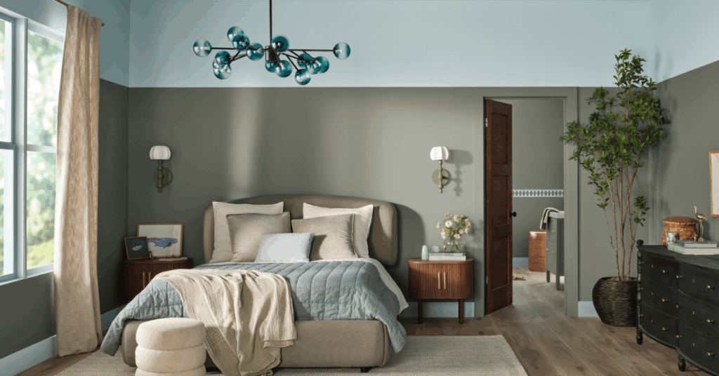
Nature-inspired hues are also having a moment. Valspar’s 2026 color, Warm Eucalyptus 8004-28F, is a green with a cool undertone. “Its warm undertones create a grounded, welcoming mood while drawing inspiration from nature and the familiarity of retro design,”said Sue Kim, director of color marketing for Valspar, based in Minneapolis. There’s also Dunn-Edwards Midnight Garden DE565, redolent of moss. According to a news release from the Los Angeles-based company, in 2026, we’ll see people wanting to bring nature indoors and into their spaces to feel more connected to the world around them.
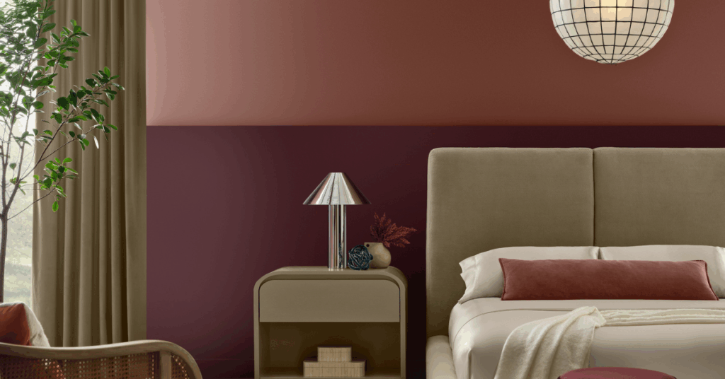
Another color that nods to nature is Divine Damson, Graham & Brown’s 2026 color of the year. The Blackburn, United Kingdom-based company drew inspiration from damson, a fruit from an Asian plum tree.

“Unlike the more subdued, earthy reds, such as rusty hues that create a relaxed and welcome atmosphere, the dark cherry red color feels bold and polished, making a strong visual statement,” said Paula Taylor, stylist and trend specialist for Graham & Brown.
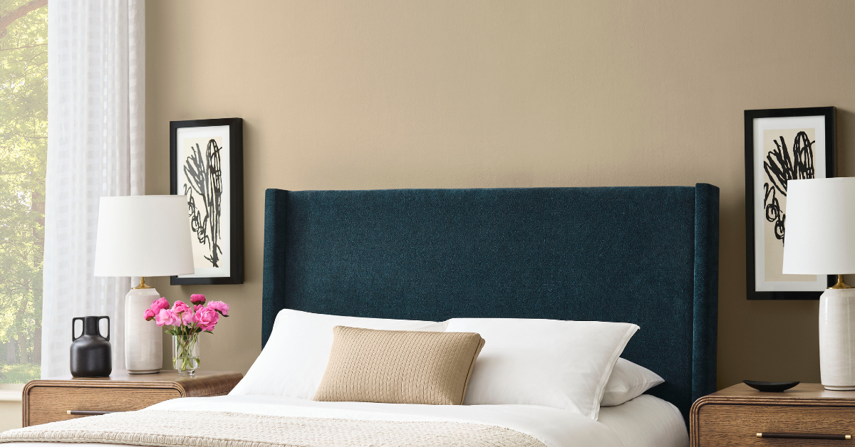
Also on the dramatic side, Benjamin Moore, based in Montvale, New Jersey, chose Silhouette AF-655, a brown with burnt umber and charcoal undertones.
Despite the proliferation of dirty pastels and moody hues — and an increasing desire to experiment with interiors — certain colors remain classics for a reason. On the more measured side, Sherwin-Williams and HGTV Home by Sherwin-Williams announced a joint choice for color of the year: Universal Khaki SW 6150. Sue Wadden, director of color marketing for the Cleveland-based company, called it a “… timeless, go-anywhere shade.”
Dutch Boy, also based in Cleveland, chose Melodious Ivory 313-2DB, a golden yellow, as its pick, which was similar to C2 Paint’s 2026 choice, Epernay #639. The Amherst, New York-based company is named after the French village of the same name and is a pale yellow shade that was popular in European interiors during the Beaux Arts and Neoclassical periods.
On the lightest end of the 2026 colors is Cloud Dancer 11-4201, a white hue chosen by global color system company Pantone. In a news release, the Carlstadt, New Jersey-based company stated it chose the color for its similarity to a blank canvas that “signifies our desire for a fresh start.” Its pure white pick is a historically popular one for bedding. Traditional white mattresses and sleep accessories such as sheets and pillowcases will always have their time and place, but there’s also an opportunity here for retailers and manufacturers.
After years of minimalism, the new color choices highlight a renewed focus on maximalism and consumers’ desire for different, bolder choices — forecasting that 2026 will be an exciting and colorful year for sleep products.